The Coliseum roars with excitement as a series of warriors are set to battle.
Arial, dressed in plain clothes and simply armed.
Rockwell, sporting a massive cleaver and bulky armor.
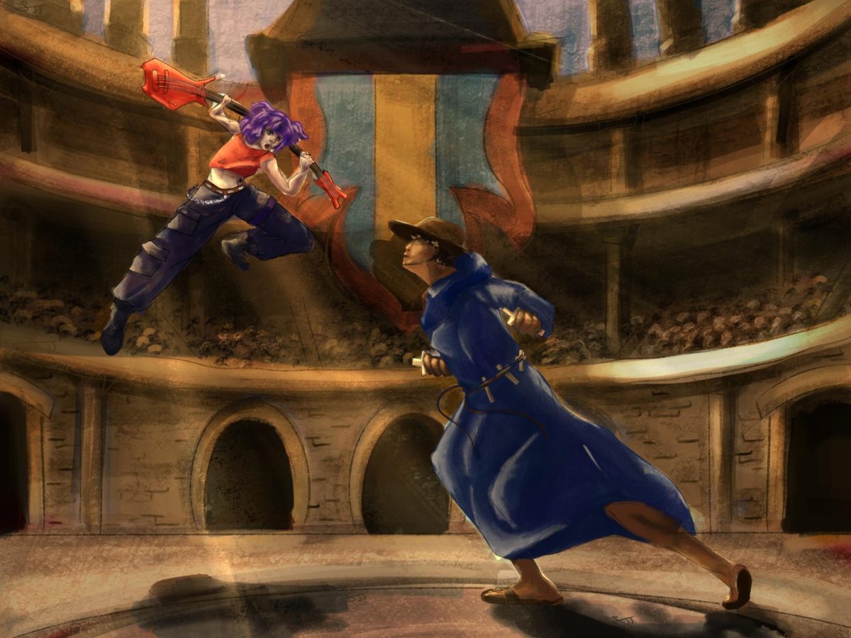
Comic Sans, with a bizarre blue hoodie and nothing but his bare hands.
Old English Text, a regal font in Shakespearean era clothing, armed with a golden quill.
ShowCard Gothic, All Baggy Pants, Purple Hair and A sweet electric Guitar.
Viner Hand, the pious conquistador, strapped with holy water.
Jokerman, tricky and invisible, his presence is only made known by the sound of laughter.
And then there’s Times New Roman, the reigning champion.
Let the battle begin!
Placing Your Bets
No championship is fun without bets. There’s no actual money involved, but its the thought that counts!
“Arial would die instantly. Times New Roman, I’d give a chance,” sophomore Linus Lee said. “I would say Old English just because it looks fancy,”
“Vinerhand or Gothic,” sophomore Sia Advani said.
“Jokerman is too unpredictable,” sophomore Jaspreet Sangha said. “I would probably bet on Arial [being the victor.] Arial [is a] no-nonsense, all purpose fighter.”
“I would bet all my life savings on the Jokerman because it’s the coolest font,” junior Louis Z. Choi said.
The Free for All
Immediately, a few sets of one on one skirmishes break out.
Arial is well-known yet not well-liked. It’s an underdog, especially facing Rockwell.
Rockwell immediately slams Arial with a heavy blow. Arial gets up, wounded. Dodging Rockwell’s powerful attacks, Arial finds a opening. Using Rockwell’s weight against itself, lean Arial knocks the bold font down, defying all expectations.
Meanwhile, Comic Sans faces Old English Text, it’s not a fair match-up.
While Comic Sans tries to land blow after blow, Old English does nothing but twirling, doing pirouettes.
Comic Sans finally gets within reach, but Old English Text defies gravity by launching himself in the air and staying there. It’s old enough to be unaware of the existence of gravity, after all. Witnessing this feat, Comic Sans just gives up.
At the same time, Showcard Gothic and Viner Hand are fighting as well. Their battle is a blur of red metal and flasks of holy water? The conquistador, Viner Hand, is absolutely appalled by Showcard Gothic’s, well, goth appearance. And when he hears the sound of her electric guitar, his exposure to such a heretic sound makes him pass out.
Old English and Showcard Gothic, cocky by their victories, aren’t aware they’re about to be hit by a trump card. Jokerman comes in for a surprise attack, laughing as he swiftly knocks out both of them. And deciding it’d be more interesting to watch the ensuing battle, he turns invisible and fades to the stands.
The Last Two Standing
Times New Roman didn’t bother engaging in any battles. And no fonts dared challenge it, the go-to choice for all essays, the font beloved by all English teachers. Times New Roman: the favored MLA font.
Arial trembles, but remembers it’s an MLA font too. A disliked one maybe, but one that undeniably has its benefits.
“I would argue that Arial is technically better simply for accessibility reasons,” English teacher Abraham Kim said.
Arial breathes deep. It knows it can win a battle of attrition.
“The letters are printed out in a way that is easier to read,” Kim said. “For someone like me who has [to read] multiple essays, it’s better as the letters tend to blend together.”
Arial approaches first, aiming for a swift jab at Times New Roman, who blocks the attack perfectly. Times New Roman, aware that Arial means to drag out this battle, strikes them with precise jabs.
Arial grows tired. It’s on the defensive. Not being able to keep up with Times New Roman’s perfectly precise jabs, it tastes the steel of its blade.
Times New Roman’s sword: thesis statement. Times New Roman’s armor: evidence. Times New Roman’s shield: reasoning. Once, before Times New Roman stole their title as MLA’s champion, Arial held the same legendary equipment.
Arial knows equipment better than anyone, the burden of being an MLA font. Summoning every last bit of its strength, Arial charges at Times New Roman.
Dodging another of its deft jabs, Arial’s rusted blade finds Times New Roman’s neck. In the popular font’s overconfidence, it forgot to wear its helmet: works cited.
A mighty warrior falls to the ground. Arial has won the battle.